Apologies for my english…
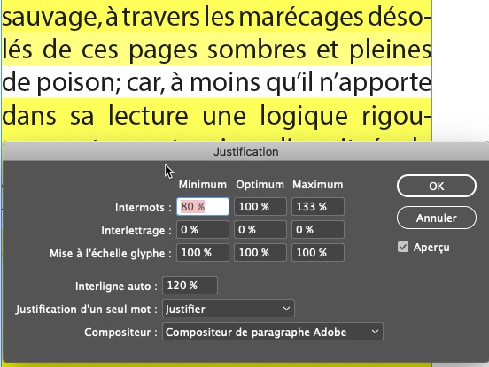
There are many different opinions on how to use this function in InDesign. To explain what it is used for, we need to start from the justification window, which allows us to set the spaces between words and letters, and therefore the scaling of glyphs, with the aim of obtaining a regular color of the page in InDesign.
justification en InDesign
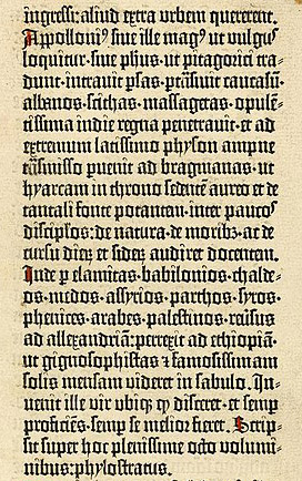
Reminder: justification in antique typography
Modern justification algorithms
In the early 1990s, calligrapher and type designer Hermann Zapf teamed up with Peter Karow and Margret Albrecht of the URW to develop a typesetting program that could reproduce the quality of the Gutenberg Bible. The so-called « hz » program combined the advantages of the Knuth and Plass algorithm with another parameter: the variation in the width of the letters.
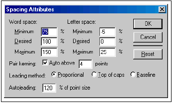
This « glyph scaling » technique does not involve varying the space between letters, but rather changing the size of the letters themselves: it involves compressing or expanding the shapes. The technology of the hz program was eventually purchased by Adobe, probably with the aim of integrating it into Adobe InDesign.
Two questions arise in relation to this.
- How does InDesign actually handle glyph scaling?
- How much worse is glyph scaling than lettering?
InDesign’s surprise for glyph scaling
Contrary to what one might imagine, this scaling is not at all a standard horizontal scaling process, which would enlarge the shape of the letter overall. It seems from my tests that, on the contrary, the letter shafts are preserved…
In the example animated gif below, the black is the base text, all 100%, while the blue text has as justification parameters this, which is of course exaggerated:

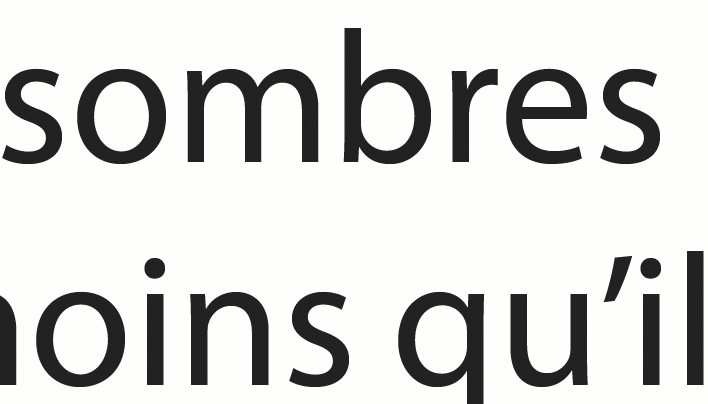
The only setting InDesign has to justify the text in this very narrow justification is the scaling of the glyph. So I force the widening to see the effects.
And what we observe… is that InDesign clearly widens the letter (in blue) while modifying very little the letter stems! This must correspond to an update of InDesign, because it clearly contradicts several tests made by Johannes Ammon or by the Norwegian typographer Torbjørn Eng.
Glyph scaling or letterspacing, which is worse?
So let’s also test the feeling, by comparing letterspacing and glyph scaling…
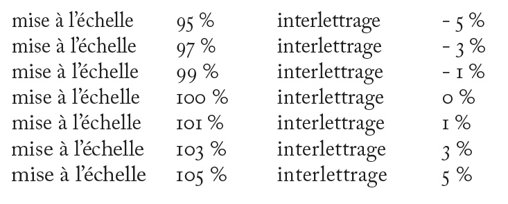
This is up for debate, but for me, at similar values, interlettering is more conspicuous than scaling, which is what I wanted to demonstrate. And clearly, in texts justified in reading size, scaling can be used again, and certainly to fight the inter-word spacing which for me is the worst, the one that should only be modified when one really can’t do otherwise, confere… Gutenberg! So why not try to reduce the inter-word space, as opposed to the default settings of InDesign… If we take these settings below, it could well go in this direction:
